9 Kitchen Textile Pairings That Make Everyday Towels Look Intentional
Working kitchen linens can look coordinated when towels, pot holders, and a small table textile share one color, scale, or texture rather than matching exactly. Keep decorative towels clear of the stove, use heat-rated pot holders for hot cookware, and choose washable fabrics that suit the kitchen’s usual spills and laundry routine.
As an Amazon Associate I earn from qualifying purchases.
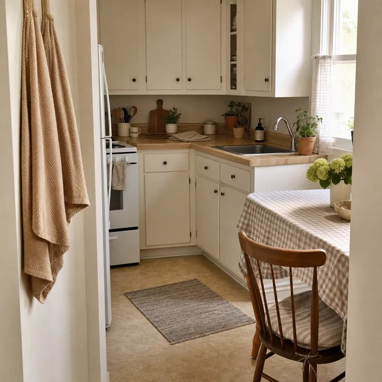
1.Gingham Towels With Solid Pot Holders
A gingham towel can set the color direction without requiring a fully matched set. Pull one quieter shade from the checks for solid pot holders, then use that same color in a plain runner or small table cloth.
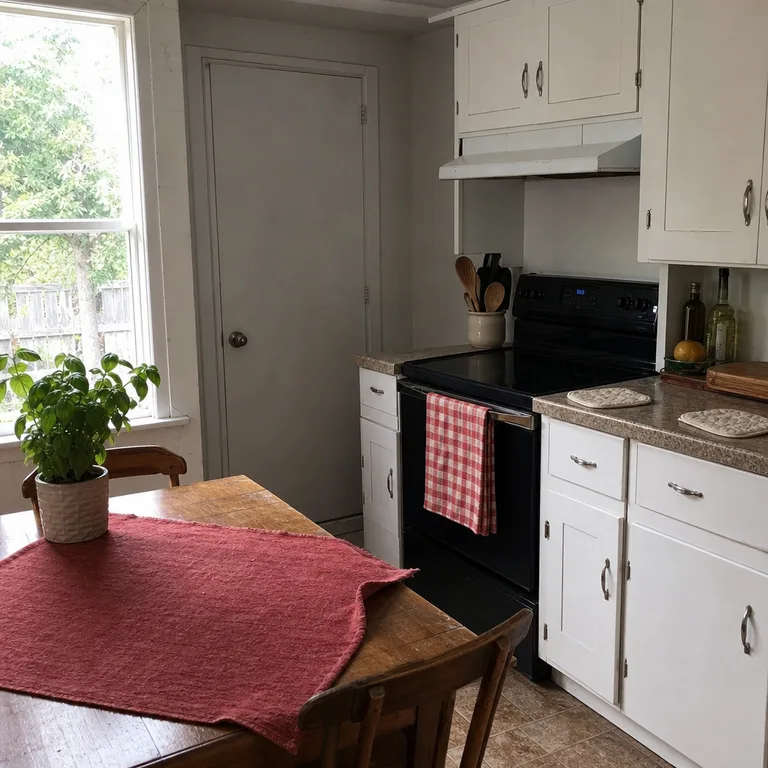
The mix works because the checked towel adds pattern while the other pieces give the eye somewhere to rest. Reuse a towel that is still absorbent but looks presentable, and choose washable solids that can handle frequent handling near the counter.
Worth knowing: Gingham can look busy in a kitchen that already has strongly patterned floors, backsplash tile, or curtains.
Related: 12 Budget Dining Table Styling Ideas for Everyday Meals
2.Striped Towels With a Plain Woven Table Textile
Narrow stripes bring a little movement to hooks, oven handles, or a towel bar. Keep pot holders plain and choose a simple woven placemat or table textile in a color that sits quietly beside the stripe.
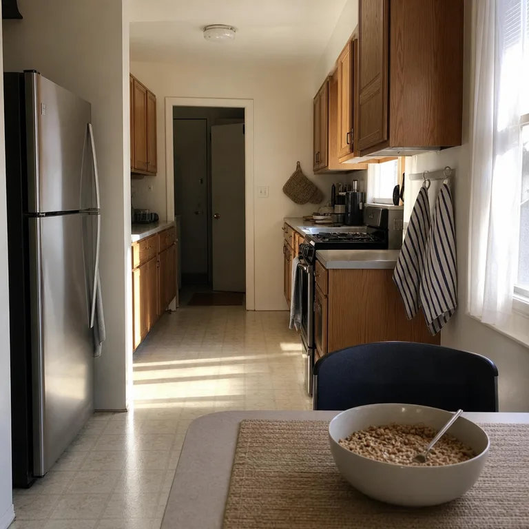
This pairing is useful when existing towels are practical but do not match the table area. An oatmeal, flax, cream, or similarly muted textile can bridge several towel colors without looking like an attempt at a formal set.
Worth knowing: Loosely woven placemats can catch crumbs and may need more shaking out or spot cleaning than flat cotton cloths.
Related: 10 Small Dining Area Ideas When You Don't Have a Dining Room
3.Waffle-Weave Towels With Smooth Cotton Basics
Pair a textured waffle-weave towel with smooth cotton pot holders and a flat napkin or table cloth. The contrast makes ordinary linens feel chosen together even when every item is a solid color.
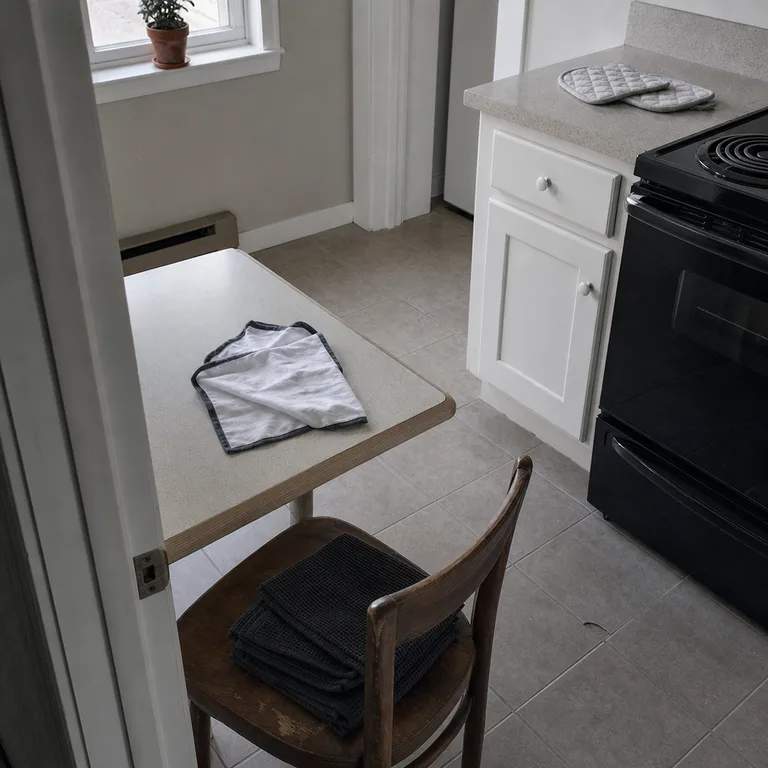
Use darker waffle towels where hands are often dried, since textured loops can make marks less obvious between washes. Smooth pot holders are easier to inspect for grease or scorch marks, so retire them when the padding or stitching starts to fail.
Worth knowing: Waffle weave can shrink or tighten after washing, so it may not stay perfectly flat or uniform over time.
4.A Floral Towel With One Pulled-Out Solid Color
Let a floral towel be the only print in the grouping. Find one subdued color from its design, such as dusty blue, soft green, or faded red, and repeat that shade in solid pot holders and a small table square.
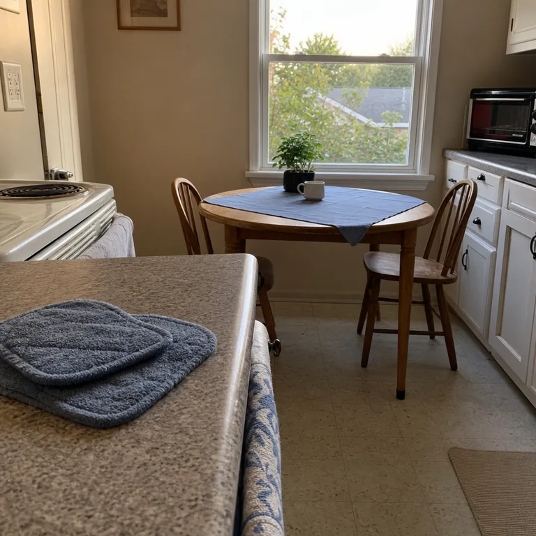
This approach gives an older floral towel a clearer role instead of making it seem random among plain kitchen basics. Choose the less dominant color from the print rather than its brightest one, which keeps the overall effect calmer.
Worth knowing: A heavily faded floral towel may make new solid pieces look too crisp beside it, especially in a bright kitchen.
5.Two Warm Neutrals Across Everyday Linens
Use two warm neutrals, such as tan and cream, across the towels, pot holders, and table cloth. Alternate them rather than assigning one color to each type of item: a tan towel can sit beside cream holders, while the table textile includes both.
The small amount of contrast prevents all-neutral linens from disappearing into one another. This is especially helpful around wood-look cabinets, beige floors, or warm laminate counters, where cool gray textiles can sometimes feel disconnected from the room.
Worth knowing: Warm neutrals can show cooking oil, tomato stains, and tea marks more quickly than darker colors.
6.One Accent Color Against Quiet Basics
Choose one accent color already present in a usable towel, then repeat it in only a few places. A colored towel, coordinating pot holders, and a lightly striped or bordered table cloth can add focus while cabinets and counters remain the visual background.

Keep the accent away from direct burner heat and splatter zones if it is a decorative textile. Heat-rated pot holders belong within reach of the stove, but towels and table cloths should stay clear of open flames, hot burners, and handles that may drag across them.
Worth knowing: A bright accent color can overwhelm a very small kitchen if it appears on too many large surfaces at once.
7.Monochrome Shades in Different Weaves
Stay within one color family but vary the shade and fabric texture. Pale ribbed towels, darker quilted pot holders, and a medium-toned slub runner create separation without introducing another color.
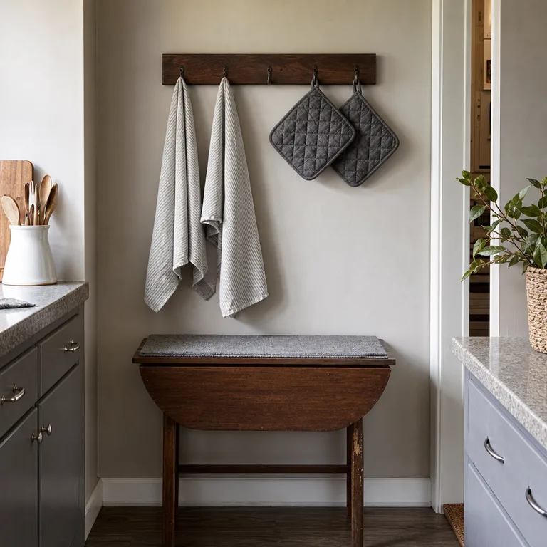
Different weaves are what keep a monochrome group from looking flat. This is an easy way to coordinate grays, blues, greens, or browns already in use, though it helps to hold the items together in daylight because undertones can differ noticeably.
Worth knowing: Similar shades can clash when one fabric has a warm undertone and another has a cool undertone.
8.Retro Print Towels With a Plain Border Towel
A retro-print towel can be softened by pairing it with a plain towel finished with a narrow border in a related color. Match solid, heat-rated pot holders to that border color, then use an off-white or neutral table cloth to give the print breathing room.
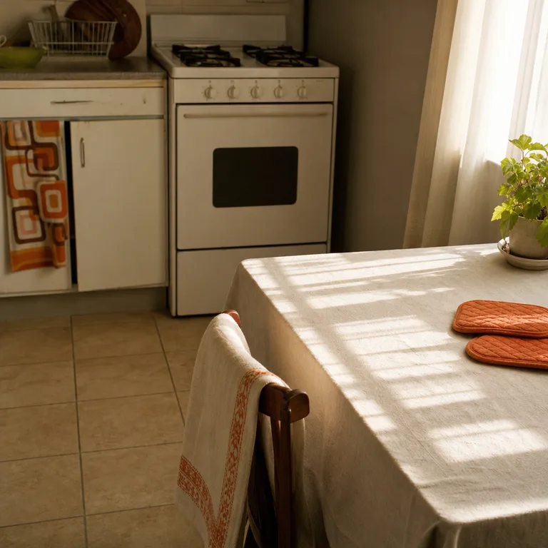
The bordered towel acts as a transition between a bold pattern and plain basics. Keep the retro towel for drying clean dishes or display away from grease-heavy prep, since detailed prints can hide stains until they are difficult to remove.
Worth knowing: Finding a border towel in the exact accent color may take more searching than using a fully solid towel.
9.Color-Block Towels With Neutral Pot Holders
Let color-block towels carry the strongest contrast, then choose neutral pot holders and a simple neutral runner or table cloth. Natural cotton, cork, cream canvas, and similar materials can calm teal, red, blue, or green blocks without competing with them.

This combination suits a kitchen where the towels need to be easy to spot and grab. Check that pot holders are genuinely heat-rated and thick enough for the cookware in use; a decorative textile is not a substitute for safe handling.
Worth knowing: Cork and natural-fiber pot holders may need gentler cleaning than machine-washable quilted cotton styles.
About the author
Dana Ruiz, Senior editor
Dana writes about small-space living, storage and low-cost decorating.
Keep reading
9 Open Kitchen Shelf Styling Ideas Using Dishes You Actually Use
October 16, 2026
10 Shower Curtain Color Schemes That Work With Dated Bathroom Tile
October 16, 2026
7 Ways to Pair Mismatched Bedside Lamps So They Look Collected
October 16, 2026
10 Living Room Color Pairings for Dark Rental Floors You Cannot Change
October 16, 2026