7 Relaxed Blue and White Room Schemes on a Budget
Blue and white feels informal when the room relies on a clear mix of painted surfaces, wood, natural fibres and just one or two patterned textiles. These seven recipes assign a dominant, secondary and accent role to each material so the look reads as a room scheme rather than a collection of blue accessories.
As an Amazon Associate I earn from qualifying purchases.
1.Denim Blue Upholstery With Pale Oak and Chalky White Walls
Make chalky warm-white walls the dominant surface, then use a faded denim-blue sofa as the main secondary color. Pale oak tables, a cream throw, and a few ivory details keep the blue from feeling too crisp or themed.
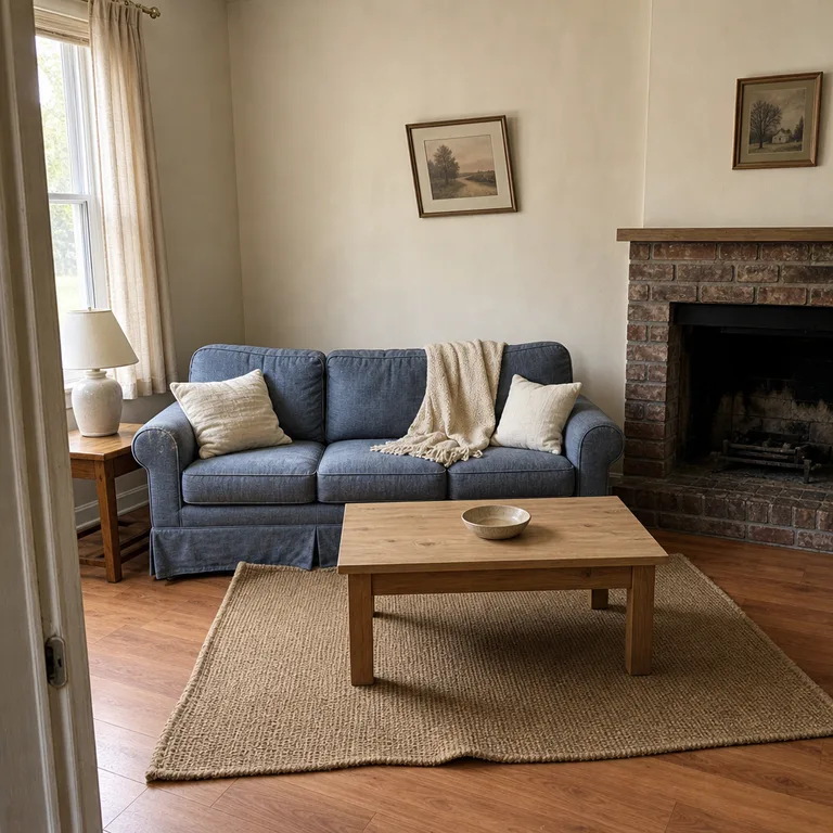
This combination has an easy, lived-in look because the blue is carried by one useful large piece rather than scattered across the room. A sofa cover, secondhand wood table, or simple oak-look side table can create the same balance without replacing every item.
Keep the wood light and the white slightly warm rather than bright stark white. It works especially well in rooms with moderate daylight, where denim blue can still look soft rather than dull.
Worth knowing: Denim-like upholstery can show lint, pet hair, and fading, so a washable cover or durable woven fabric is more practical in busy homes.
Related: 12 Warm Neutral Living Room Ideas on a Budget
2.Indigo Block Print With Woven Grass and Cream Walls
Let cream walls and a plain neutral rug do most of the visual work. Add indigo block-print pillows and curtain panels as the secondary layer, then use seagrass baskets, woven shades, or a grass-cloth lamp shade as small natural accents.
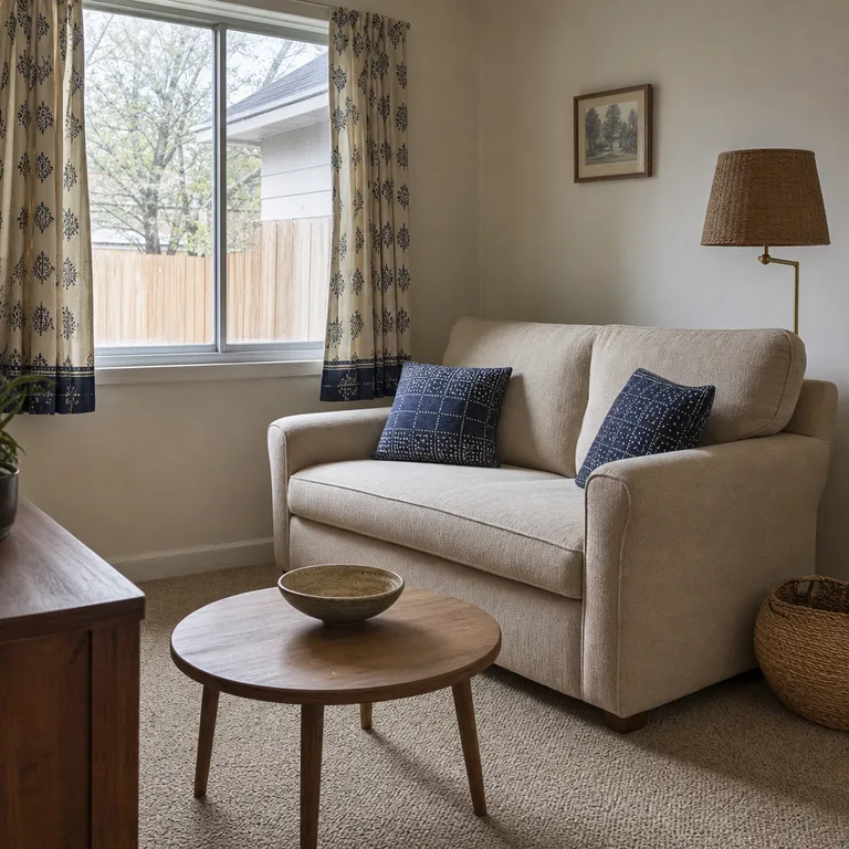
The hand-stamped look of block print brings pattern without requiring matching furniture or formal décor. Its imperfect repeat also works nicely with affordable cotton textiles and older wood pieces that already have some wear.
Use the print in a few places that can be seen together, such as the sofa and window, rather than covering every surface. In a narrow living room, the cream background gives the eye enough quiet space around the stronger indigo pattern.
Worth knowing: Too much block print can make a small or dark room feel enclosed, so leave large upholstery and wall surfaces plain.
3.Sky Blue Painted Wood With White Slipcovers and Terracotta
Use pale walls and white slipcovered seating as the dominant surfaces. A sky-blue painted cabinet, side table, or chair supplies the secondary color, while one or two terracotta pots add a warm, earthy accent.
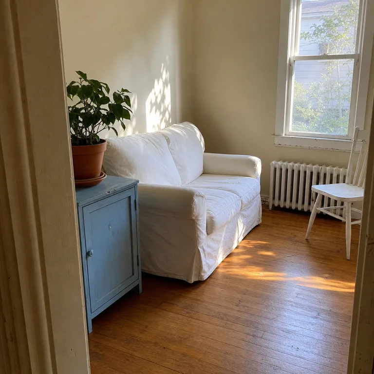
Painted wood is a practical way to introduce blue when a new sofa or rug is not in the plan. An older cabinet with sound drawers or a sturdy small table can become the focal point after basic cleaning, prep, and a paint finish suited to furniture.
Keep the blue on a defined wood piece so the room still feels calm and useful. Terracotta is enough warmth to stop the white and blue from looking chilly, especially beside natural floorboards or woven textures.
Worth knowing: Pale blue can read gray in a dim room, so this scheme is best near a sunny window or in a space with reliable warm lighting.
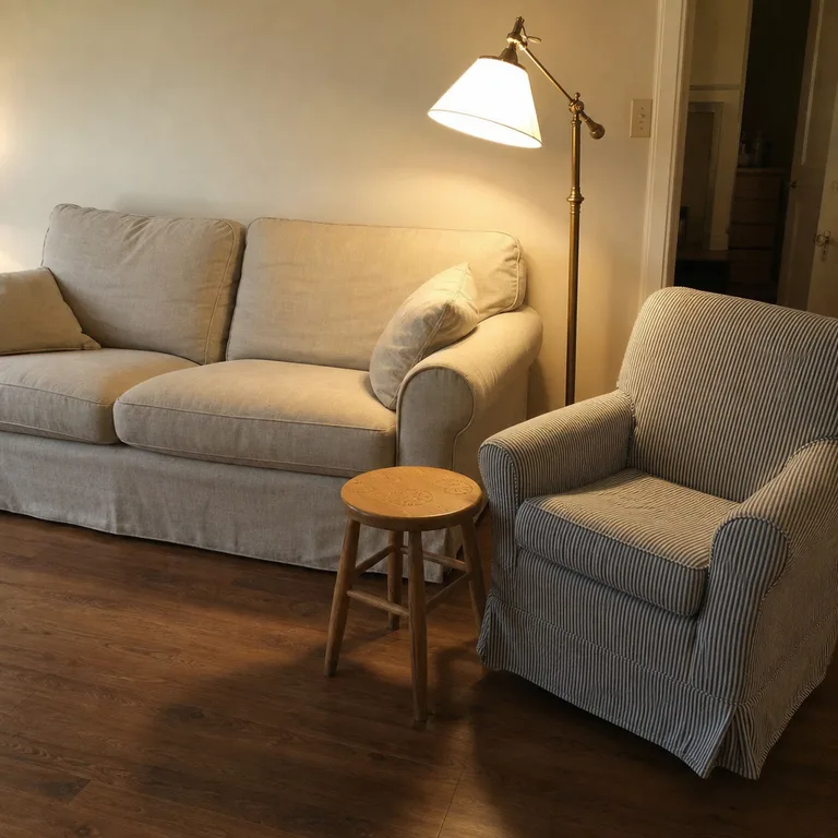
4.Blue Ticking Stripe With Soft Linen and Natural Wood
Build the room around warm-white walls and soft linen or linen-look upholstery. Use blue ticking stripe on one chair, a pair of cushions, or a simple bench cushion, then add natural wood and aged brass as the accent materials.
The narrow stripe gives the room a little structure while staying more relaxed than a large graphic pattern. It also pairs easily with mismatched wood furniture, since the stripe acts as a small repeated detail instead of demanding a coordinated set.
Choose washable striped covers for chairs and cushions if the room is used for everyday meals, pets, or children. A maple stool, plain wood coffee table, or older brass lamp can make the scheme feel collected without adding more blue.
Worth knowing: Ticking stripe can quickly lean nautical if it is combined with anchors, rope, or too many coastal accessories.
5.Cobalt Ceramics With Warm White Walls and Walnut
Keep the largest surfaces warm white: walls, curtains, and most upholstery. Walnut furniture becomes the secondary grounding material, while cobalt appears only in a tight group of ceramic vases, a bowl, or a lamp base.
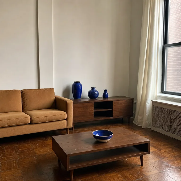
Cobalt has enough visual weight to make a room feel intentional in very small doses. Grouping a few pieces on a console or coffee table is more effective than placing individual blue objects around the room, and it leaves the rest of the space uncluttered.
A walnut-toned cabinet, table, or secondhand wood piece adds depth against warm white paint. Look for ceramics with varied shapes but a related blue tone, rather than trying to assemble a large matching collection.
Worth knowing: Cobalt can feel sharp and busy when it is scattered throughout the room, so this recipe needs clear surfaces and restrained styling.
6.Faded Blue Floral With Honey Wood and Ivory Cotton
Use ivory walls and cotton seating as the dominant foundation. Faded blue floral curtains or one lumbar pillow become the secondary patterned layer, while honey-toned wood tables provide the warm accent that keeps the room from feeling overly delicate.
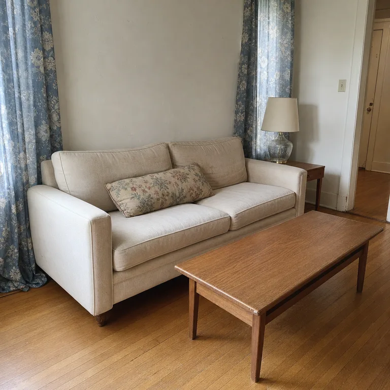
A washed-looking floral works well when the rest of the room is simple. The fabric can soften plain rental-friendly furniture covers, basic curtain rods, and inherited wood pieces without turning the whole space into a formal parlor.
Give the floral room to breathe by repeating it in only one or two textile items. Honey wood is especially useful in older homes with oak floors or existing wood trim, since it makes those fixed features part of the scheme rather than something to hide.
Worth knowing: Floral fabric needs plenty of plain surrounding surfaces; repeated across curtains, upholstery, and rugs, it can make the room look crowded.
7.Inky Blue Checks With Canvas and Blackened Metal
Start with off-white walls and natural canvas upholstery as the dominant surfaces. Add inky blue checks through cushions and a folded throw, then use blackened metal in a lamp, table base, or slim shelf for a firm accent.
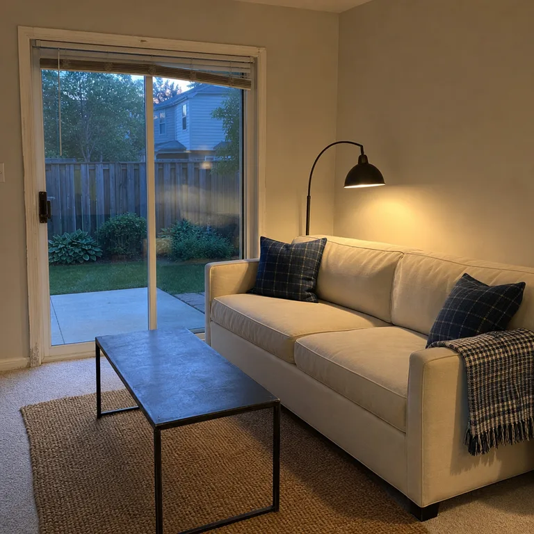
The check adds contrast and a little graphic energy while canvas keeps the room grounded and informal. This is a useful recipe for a practical family room because canvas, simple metal, and checked removable covers do not require delicate styling.
Limit the dark pattern to a small zone around the seating area. Blackened metal works best as a line or frame in the room, such as lamp legs or a coffee-table base, rather than as a heavy run of dark furniture.
Worth knowing: Dark blue checks can feel weighty in rooms with low winter light, so use them sparingly and keep the surrounding walls and upholstery light.
About the author
Dana Ruiz, Senior editor
Dana writes about small-space living, storage and low-cost decorating.
Keep reading
10 Budget Coastal Living Room Ideas That Feel Relaxed
November 12, 2026
8 Budget Mini Christmas Tree Arrangements for Tables
November 11, 2026
7 Budget Ways to Give a Plain Bookcase More Character
November 11, 2026
8 Minimalist Christmas Decorating Ideas That Feel Festive
November 11, 2026