10 Kitchen Color Accents That Work With Oak Cabinets
Sound oak cabinets can look intentional when one accent color appears in two or three small, useful places around them. These ideas use washable textiles, art, lighting, and countertop accessories that can be changed without altering the cabinets.
As an Amazon Associate I earn from qualifying purchases.
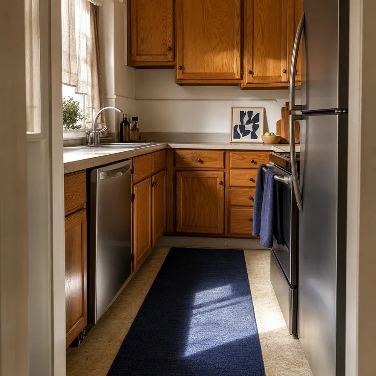
Choose a low-profile washable runner so doors and appliances can open freely over it. Lean a small framed print against the backsplash if wall hanging is not practical, and keep the rest of the counter mostly clear so the navy reads as an accent rather than visual clutter.
Worth knowing: A dark runner can show flour, lint, and pet hair quickly, so it needs regular shaking or washing.
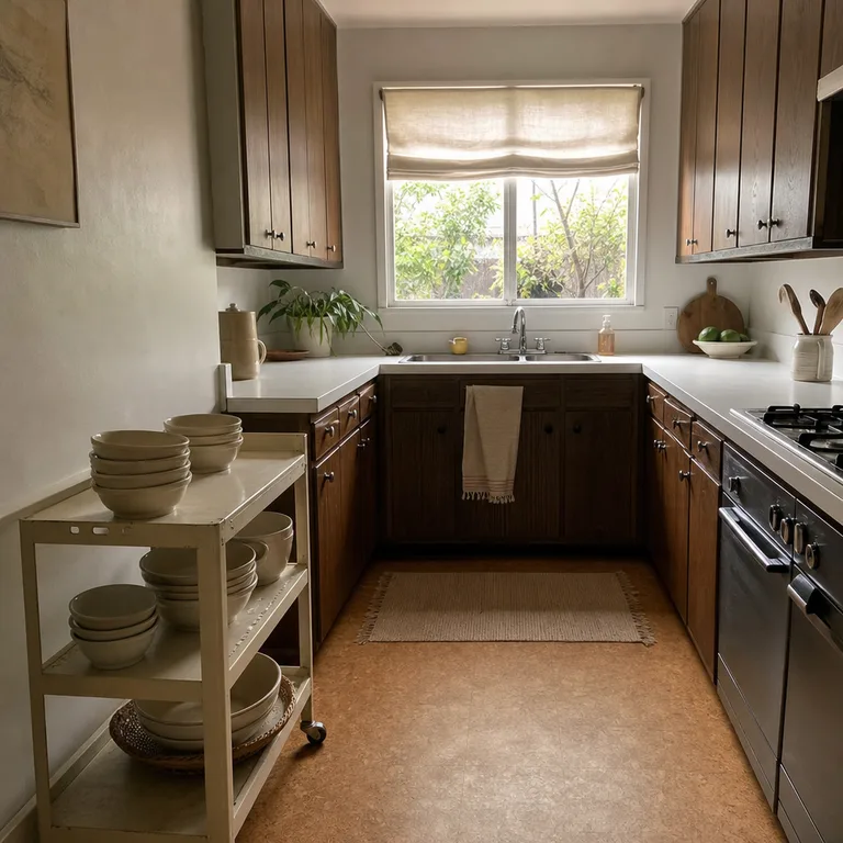
2.Sage Green in Window Fabric, Canisters, and a Mat
Muted sage green has enough gray in it to sit quietly beside medium and light oak. Use it in a café curtain, a few dry-goods canisters, and a cushioned sink mat for a soft, settled look.
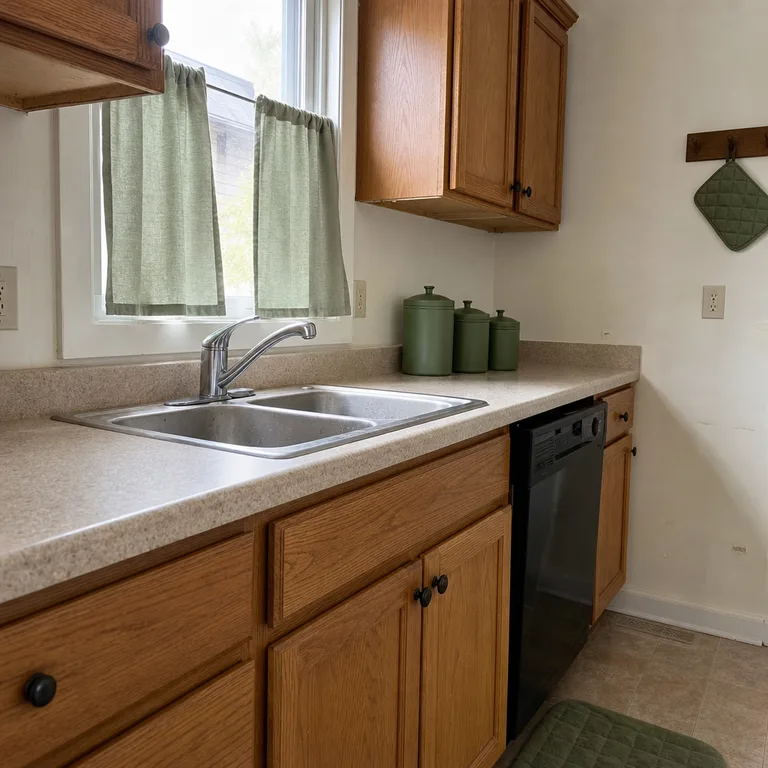
Keep the window fabric simple and washable, particularly near a sink or range where grease and moisture collect. Canisters work best when they hold regularly used items, while a mat should have a non-slip backing and be easy to move for floor cleaning.
Worth knowing: Sage can look dull in a kitchen with very little daylight, especially against already gray counters or flooring.
3.Terracotta in Wall Art, Pottery, and Linen
Terracotta brings out oak's natural warmth but looks more deliberate when it appears in different materials. A geometric print, an unglazed utensil crock, and one striped linen towel add warmth without covering the cabinets themselves.
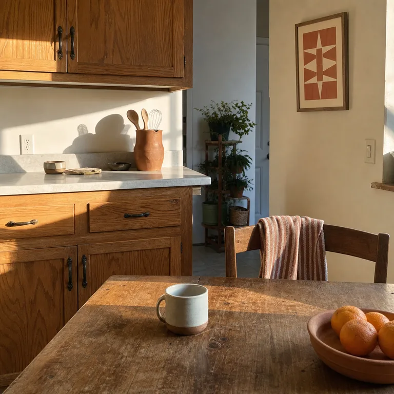
Use a print with cream or off-white in it to break up the stronger clay color. Keep pottery to one useful piece on the counter, such as a utensil holder, and choose a towel that can handle frequent washing rather than treating it as decoration only.
Worth knowing: Terracotta can make very orange or golden oak feel warmer still, so it is less useful when the room already feels overly yellow.
4.Charcoal in a Plug-In Sconce, Fruit Bowl, and Stool Seats
Charcoal gives pale oak cabinetry sharper definition while still feeling softer than pure black. Repeat it in a plug-in sconce, a stoneware fruit bowl, and stool seats to add structure around a breakfast ledge or open wall.
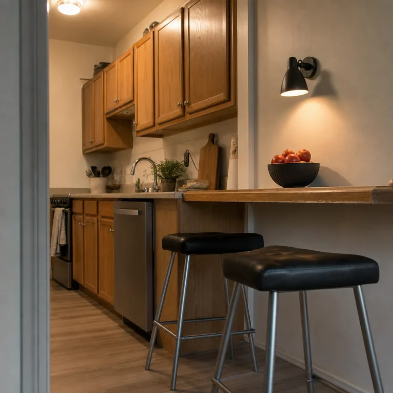
A plug-in sconce can add useful evening light without changing hardwired fixtures, but route its cord neatly and keep it away from sink splash zones. Balance the dark pieces with light walls, counters, or open floor area so a compact kitchen does not become visually heavy.
Worth knowing: Plug-in lighting depends on a conveniently placed outlet, and visible cords may not suit every layout or rental agreement.
5.Cream in Roman Shades, Dishware, and a Utility Cart
Cream softens dark oak cabinets by adding light-colored surfaces at the window, counter, and storage edge. A washable Roman shade, everyday cream dishware, and a small utility cart can make a darker kitchen feel less enclosed.
Choose dishware that is sturdy enough for daily meals, then store only the pieces used often on the cart. A narrow cart can hold bowls, produce, or linens, but it needs a clear parking spot that does not block cabinet doors, drawers, or the main walking path.
Worth knowing: Cream fabric and painted carts show cooking splatters and scuffs more readily than darker finishes.
Related: 12 Budget Dining Table Styling Ideas for Everyday Meals
6.Dusty Blue in a Seat Cushion, Pitcher, and Framed Botanical
Dusty blue is a calm cooler companion for red or honey oak. Repeat it in a seat cushion, a ceramic pitcher for utensils, and a simple botanical print to spread the color through a small eating area and work zone.
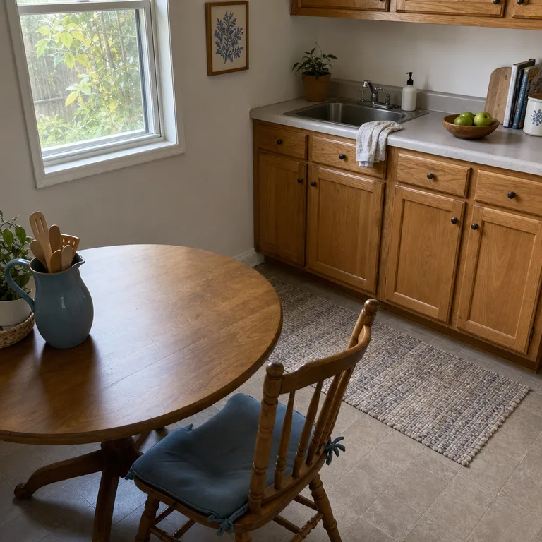
Select a cushion with a removable or washable cover, since kitchen seating catches crumbs and spills. A pitcher can hold utensils near the prep area, but place it far enough from the cooktop to avoid grease buildup and heat exposure.
Worth knowing: Dusty blue may look flat in very dim kitchens unless there is enough pale wall or counter space around it.
7.Mustard Yellow in a Valance, Tray, and Oven Mitts
Mustard yellow gives neutral oak cabinets a brighter note without needing a large painted wall or new backsplash. A short valance, enamel tray, and quilted oven mitts concentrate the color in small, functional areas.
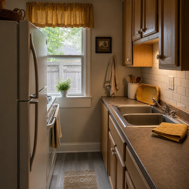
This shade is especially useful in kitchens with limited direct sun, where warmer accents can keep the room from feeling washed out. Keep the valance well above the sink and any heat source, and use the tray for serving or corralling everyday items rather than leaving it empty.
Worth knowing: Mustard can compete with oak that already has strong yellow undertones, so it works best in restrained amounts.
8.Muted Blush in a Floor Mat, Vase, and Kitchen Clock
Muted blush can bring a light, gentle contrast to pale or less-orange oak. A woven floor mat, a small glass vase, and a blush-rimmed clock repeat the color without turning it into a dominant theme.
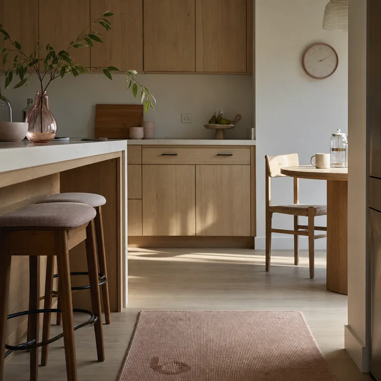
Choose a dusty, grayed blush instead of a bright pink for a more adaptable result. Keep it to practical pieces and small wall accents, since broad blush surfaces can make some oak finishes look more orange by comparison.
Worth knowing: This combination is less forgiving with strongly orange cabinets, where blush can create an overly warm overall palette.
9.Forest Green in Plant Pots, Storage Baskets, and a Towel
Forest green adds depth beside oak because it echoes the look of leaves and natural materials. Use ceramic herb pots by a bright window, matching baskets on an open shelf, and one sturdy waffle-weave towel near the sink.
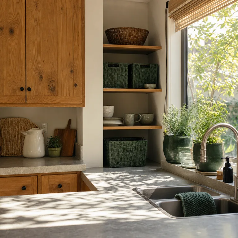
Use plants only where sunlight suits them, or choose empty pots for tools and small supplies instead. Baskets are most useful when they hide loose packets, linens, or rarely used kitchen items, but labeling them lightly can prevent the shelves from becoming catchalls.
Worth knowing: Live herbs need consistent light and watering, and water rings or mineral marks can form under pots if trays are not used.
10.Rust Red in a Pendant Shade, Table Linens, and Salt Cellar
Rust red gives weathered or muted oak a grounded contrast that feels warmer than charcoal and deeper than terracotta. Repeat it overhead in a pendant shade, across the table in cotton placemats, and on the counter with a small ceramic salt cellar.
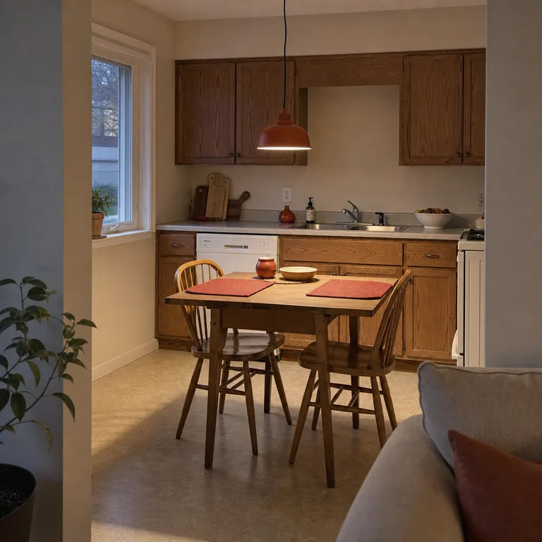
A new pendant shade can change the view at the center of an eat-in kitchen, but check that it fits the existing fixture and does not interfere with the bulb's heat clearance. Use washable table linens for daily meals, and let the salt cellar be the smaller repeat rather than adding more countertop objects.
Worth knowing: Changing a pendant shade can be more difficult than swapping textiles, and some fixtures are not designed for aftermarket shades.
About the author
Dana Ruiz, Senior editor
Dana writes about small-space living, storage and low-cost decorating.
Keep reading
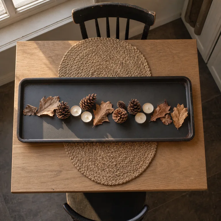
10 Thanksgiving Centerpiece Ideas Using Everyday Dishes
September 30, 2026
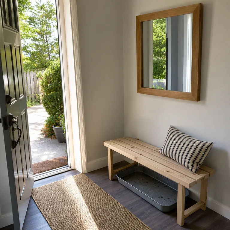
10 Entryway Mirror Styling Ideas Around Furniture You Already Own
September 30, 2026
10 Small Backyard Zone Ideas for Play and Quiet Seating
October 2, 2026

10 Fall Porch Planter Ideas Using Pots You Already Own
October 1, 2026