10 Budget Colorful Decorating Ideas to Wake Up a Beige Room
Neutral furniture gives color a calm background, so a room can become more expressive without replacing its largest pieces. These ten approaches place color in fabrics, art, objects, and small updates, with a practical limit for each so the room still feels settled.
As an Amazon Associate I earn from qualifying purchases.
1.Drape One Saturated Throw Across a Neutral Sofa
A single saturated throw can change the visual weight of a beige sofa without covering it up. Cobalt, rust, or grass green works especially well when the rest of the cushions stay oatmeal, cream, or another quiet neutral.
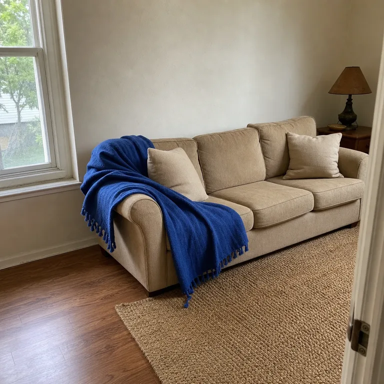
Choose a throw with enough body to hold a loose diagonal drape across one arm and part of the seat. Cotton and washable blends are practical choices for a sofa used daily by children, pets, or frequent guests.
Worth knowing: A thin or slippery throw may constantly slide out of place, and a high-maintenance fabric is not ideal for a heavily used sofa.
2.Make a Color-Blocked Paper Gallery Above the Sofa
Frame solid sheets of colored paper in a small, orderly grid to add clear color without committing to a painted wall. Four frames in red, blue, yellow, and lilac create a graphic focal point while the sofa and wall remain neutral.
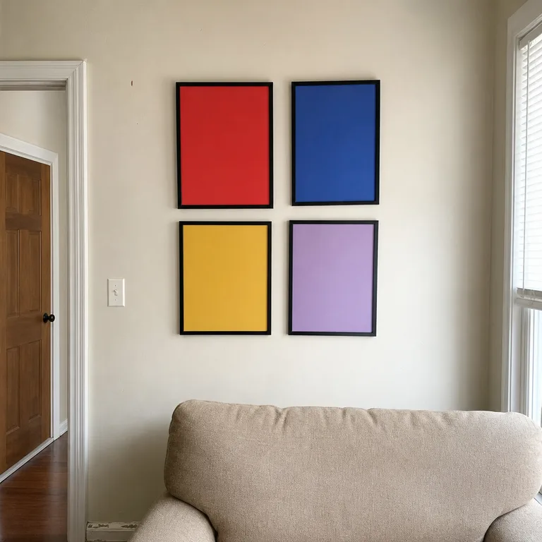
Use matching simple frames and leave consistent gaps between them so the paper reads as one composition. This is easy to revise with new paper later, but hang the group away from strong direct sun to reduce uneven fading.
Worth knowing: Paper can fade or ripple in sunny or humid rooms, so it is less suitable for a wall that gets intense daily light.
3.Paint a Small Side Table One Clear Color
A small wood side table is a useful place for a confident color such as deep teal, cherry red, or butter yellow. Because the piece is compact, it adds personality beside a neutral sofa without turning the entire room into a color project.
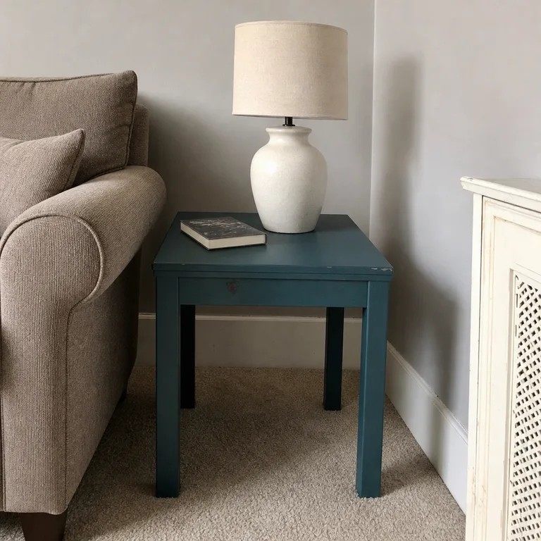
Clean and lightly prepare the surface according to the finish product instructions, then test the color on an inconspicuous area or sample board first. Check the test patch in morning, afternoon, and evening light, since a shade can look very different as daylight changes.
Worth knowing: Painted furniture can chip at corners and tabletops, particularly if the table is used for drinks, keys, or daily clutter.
4.Swap in a Contrasting Lamp Shade
A colorful lamp shade gives a neutral reading corner a concentrated accent at eye level. Persimmon, moss green, or muted berry can make a plain floor lamp look more deliberate while leaving the existing chair and walls untouched.
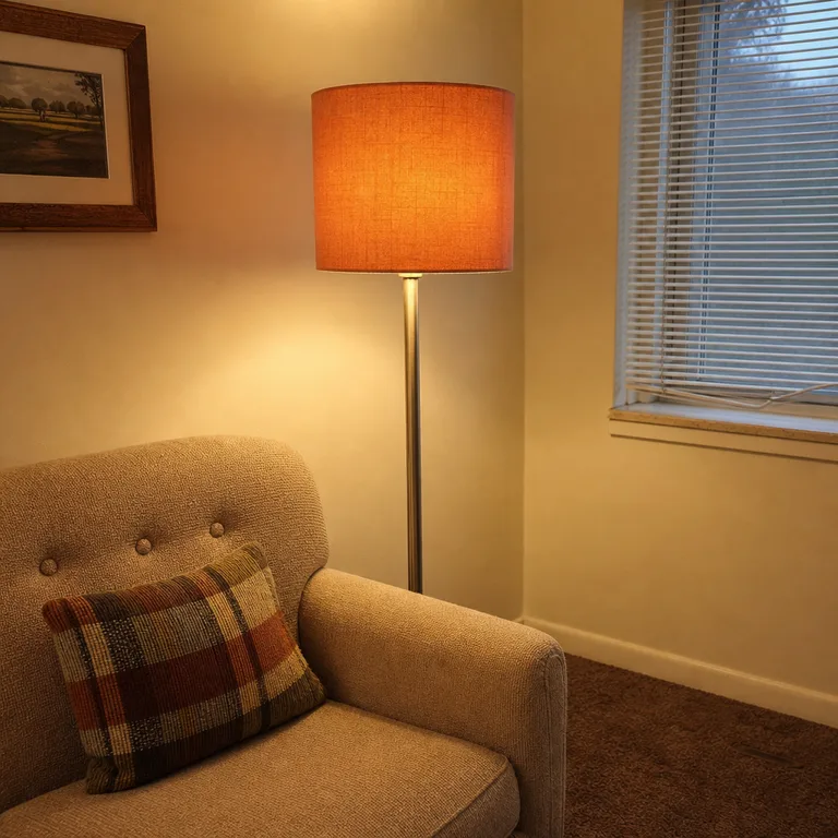
Match the shade to the lamp’s fitting and choose a shape that does not overwhelm the base. A pale interior lining helps preserve useful light for reading, while a dark or deeply colored lining may make the corner feel dimmer after dark.
Worth knowing: A strongly colored shade can tint the light it gives off, which may not suit a lamp that needs to provide clear task lighting.
5.Build One Color-Sorted Patch of Books
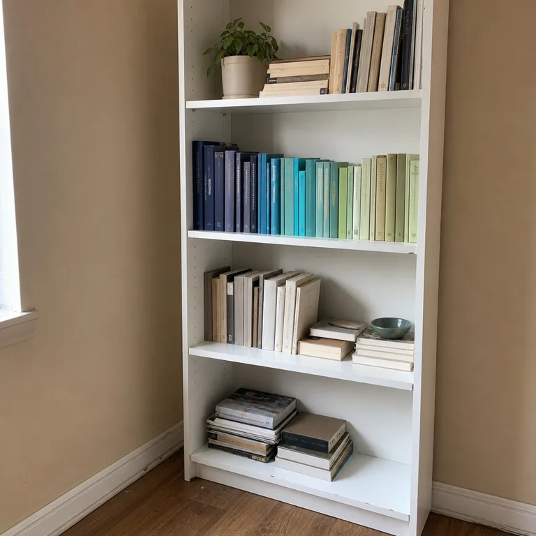
Create one short run of books that moves through a related range, such as navy to turquoise to pale green. Keeping the color sorting to one shelf or section makes it feel like decoration rather than a rigid storage system.
Start with books already in the house, then adjust their order by spine color and height. Leave the rest of the bookcase arranged for practical use so frequently read titles do not become hard to find.
Worth knowing: This approach depends on the books already owned, and it can become inconvenient if every shelf is sorted by color instead of subject or use.
6.Layer a Two-Tone Textile on the Coffee Table
A runner or folded cloth in two distinct colors can give a plain coffee table a clear center. Wine red paired with dusty pink, or blue paired with chartreuse, brings in color through a soft layer rather than another permanent object.
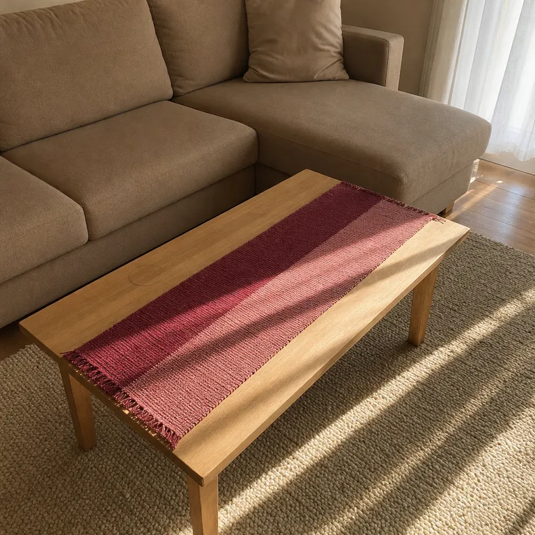
Run the textile lengthwise and leave open space at both ends for remotes, drinks, and everyday use. A washable fabric is the most forgiving option for a table that regularly sees snacks or spilled coffee.
Worth knowing: A textile can make a small coffee table feel crowded if there is not enough bare surface left for the way the room is used.
7.Group Bright Ceramics on One Surface
A small group of bright ceramics makes color look intentional when the pieces share a surface and vary in height. Try three to five vessels, bowls, or candleholders in related clear tones such as marigold, coral, sky blue, and leaf green.
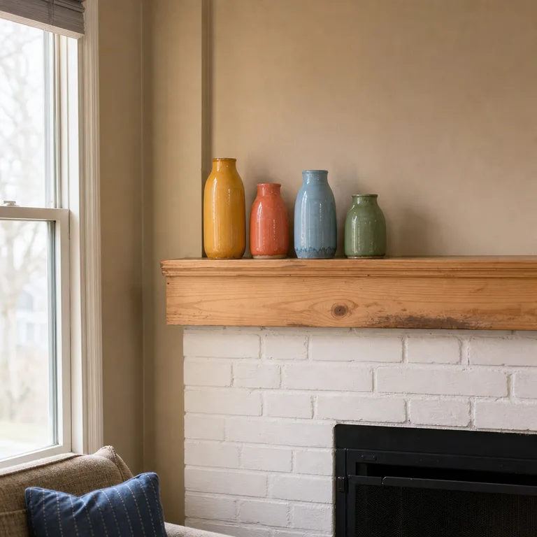
Use a mantel, shelf, or console that is already visible but not overloaded. Mixing a few shapes keeps the group from looking like a matching set, and using existing vessels can make this a gradual update rather than a shopping project.
Worth knowing: Ceramics are fragile and should stay away from unstable edges, active play areas, and surfaces that get bumped often.
8.Lean a Colored Removable Panel Behind a Console
A lightweight panel covered in colored removable film or fabric can make a graphic backdrop behind a console without changing the wall itself. Citron yellow, cobalt, or tomato red works as a strong vertical block behind neutral furniture and accessories.
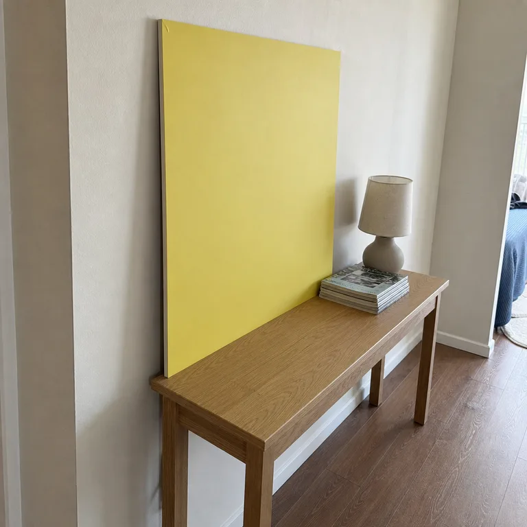
Keep the panel freestanding and sized to sit securely behind the console, rather than treating it as a wall alteration. This makes the idea especially useful in rentals where permanent changes are restricted, and it can move with the room later.
Worth knowing: A leaning panel takes up some floor depth and needs a stable location where it will not be knocked over by children, pets, or a busy walkway.
9.Use Cushions With a Contrasting Edge
Cushions with piping or a narrow border add a precise, controlled line of color to a neutral sofa. Cream covers with tomato-red piping, for example, keep most of the seating calm while giving its outline more definition.
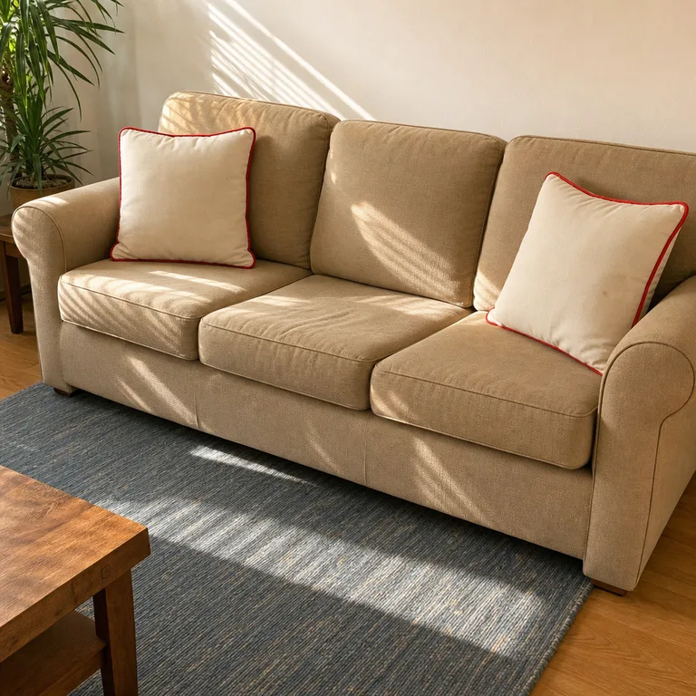
Use just two cushions at opposite ends of the sofa for a clean result. Removable covers are practical in family rooms because the colored trim can stay part of the look even when the covers need washing.
Worth knowing: Piped edges can wear or snag sooner than plain cushion covers, especially on seating that gets heavy daily use.
10.Repeat One Accent Color at Three Distances
Repeat one accent color in the foreground, middle of the room, and farther back to make a neutral space feel connected. A cobalt mug on the coffee table, a cobalt throw on the sofa, and a small cobalt detail in framed art create a clear visual path through the room.
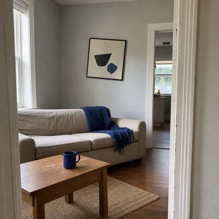
Keep the repeated pieces different in scale and function so the color does not feel like a matching set. One hue is usually enough; the beige furniture and walls then remain a restful baseline around the brighter details.
Worth knowing: Too many repeats of the same strong color can make a small room feel busy, particularly when other patterns and colorful objects are already present.
About the author
Dana Ruiz, Senior editor
Dana writes about small-space living, storage and low-cost decorating.
Keep reading
10 Easy Ways to Make Christmas Gift-Wrapping Look Coordinated
November 7, 2026
9 Easy Furniture Refreshes for Tired Pieces That Still Work
November 7, 2026
7 Easy Furniture Painting Projects to Refresh Your Home
November 7, 2026
8 Budget English Country Kitchen Ideas to Soften Existing Cabinets
November 7, 2026